Monday 30 May 2016

FMP FINAL STATEMENT

My final outcome for my final major project consists of three videos, two for the exhibition and one from the exhibition, many pieces of spray painted cardboard/prints and a zine made from the photos of the night of my exhibition. I started off this project by digging deep into my personal and emotional thoughts on life after death, and although I do not believe in an afterlife, I still found the prospect of Heaven, Hell and Purgatory outstandingly intriguing and followed this up with extensive research with books, web pages, films, documentaries and peoples personal views and opinions. My original proposal suggested that I would have some sort of space where I would gather all my work, but I was not expecting this to reach hiring out a space and putting on my first exhibition. 

My blog was used as a documentary of my thoughts and ideas but also as a reflective tool where I could look back at what I had done and what worked and what didn't and use that to my advantage. I believe that my blog was instrumental in flourishing and finding pleasure in this project. Along with the blog I have filled 5 small notebooks that I carried around in my pocket everywhere, this allowed me to jot down or doodle every thought I had no matter where I was. This ended up creating a series of random thoughts and ideas that's mimetic of my thought process, as if I have put my brain on display. I'm incredibly proud of these as I think that it's something that people tend to avoid because many people don't like the thought of everything being neatly laid out, by letting these bad habits go I have created something incredibly personal to contrast the heavily research and documentary style blog.

Discussing my project with several tutors, classmates and peers I was able to gain outside insight in what other people believed was working or wasn't. This was essential to me because I truly wanted people's opinions to not only play a significant part in their experience of the exhibition, but to also influence my development as the original concept is so subjective. My tutors recommended a huge amount of different reading and watching material that was instrumental in the key developmental stages of my research, for example one tutor suggested to look at the Chapman Brothers and Goya documentary that was incredibly influential to me and my final outcome of the posters in my exhibition. Group tutorials and reviews were also useful, bouncing ideas back and forth with each other and being able to see how different people's minds work and even learning more about myself when giving others feedback was so important and educational to me. 

I have surprised myself in unexplainable ways at every part of this project, I never thought I could be so passionate and invest so much of my time and energy into one thing before I started. I think I have proved others wrong by completing everything in a timely, well executed and professional manner and undertaking every task largely on my own terms and in my own way whilst still taking advice of others. This project, although thoroughly enjoyed, was genuinely one of the most frustrating, tiring and draining thing I have done in a long time, there were times when I felt like everything was over but I managed to keep a positive headspace and persevere through it. The exhibition itself was a huge success, everyone who came gave me an array of congratulations, although there is a few things I would've changed such as having more time, I never thought the outcome would be so magnificently pleasing to myself and others. I am incredibly proud of myself for working so hard and thoroughly and putting on my very own exhibition, it is something I will never forget about and I can't wait for the next challenge I give for myself.

Friday 20 May 2016

ZINE

With all the photos Ruby took on the night I made a 24 page zine, heavily influenced by punk graphics and zines, I made a moodboard to help me create this vibe.


Sniffin' Glue and the graphics from the punk band Black Flag were the biggest influence for me, I also wanted to get a heavily photocopied vibe across so I printed out all the pages and then photocopied them with the density turned down, so it looks faded, giving that DIY and money/ink saving look. The digital zine is seen below:


Saturday 14 May 2016

EXHIBITION DAY 

Setting up for the exhibition went relatively smoothly, I had everything where I wanted it; 2 old TVs on stools, all the cardboard pieces hanging from the brick wall on nails, and the spray painted prints on the white walls. I also included 3 installation pieces, 1 traffic cone painted all white, 1 traffic bollard covered with friends' tags and my Satan and Lucifer tags with a light inside the bollard so it lit up, and a tv on the floor playing static with a pair of shoes and bottle of vodka facing it. The idea of the white traffic cone was to glamorise the idea of stopping, the cone looked heavenly and hopefully encouraged viewers to stop and think. The traffic bollard was the idea of people reclaiming a piece of the city and attempting to be immortal through their vandalism, the fact that it was lit up also allowed me to have the room even darker. The TV on the floor has an old story behind it, about 5 years ago I walked past a bridge in Archway which is colloquially known as 'suicide bridge' because of the countless times people have jumped from it and I saw a pair of shoes and an empty bottle of vodka placed neatly by the side of the bridge where someone had contemplated suicide but decided not to. I wanted to recreate this because contemplation is a big part of my exhibition, I wanted to make people question themselves and their ideas. The night of the exhibition was great and a lot of fun, people enjoyed the art a lot and had a good time hanging out, I had a classmate, Ruby, taking photos and Toyé taking videos to document the night without having to be occupied during the night. However one of the TVs playing the Death/Hell video stopped working for some reason about an hour before the end of the exhibition, in my angered state I took the TV upstairs and onto the street where I began hitting it repeatedly with my skateboard. All the viewers came up to see this and I'd like to think of it as a piece of performance art, the mindless vandalism and ignorant attitude was already a theme of my exhibition so I rolled with it. Below is several pictures from the night, however I plan to make a zine out of the pictures so I won't include all of them here, I also have edited the footage and have attempted to capture the vibe of the night rather than just the art.


Tuesday 10 May 2016

HEAVEN VIDEO FINAL

After thinking about the heaven video for a long time, I took a video camera out with me every time I went out for about 2 weeks and filmed my most peaceful and content moments, I took footage from a trip to Norway I took earlier this year of bits of nature that I found beautiful. I also made an animation like I had planned of a dead man turning into a cloud and a series of all the photos i could get that include me or my friends this past year. I also worked on a 3D animation of shapes in a very surreal environment, it took a long while and the result is quite simple and is very dreamy. The music for each little section was chosen to fit the mood, but also are 4 songs that I have always really enjoyed and put me in a good mood. This video is definitely the most personal project of the FMP and I'm very happy with the result.


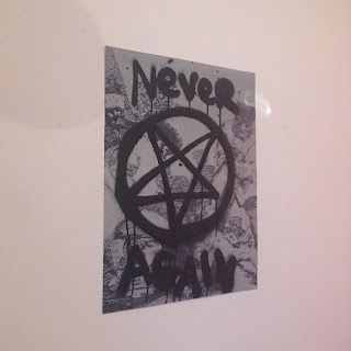
SPRAYING ON TOP OF PRINTS

From the prints I ordered from instantprint I finally managed to decide on what phrases/graphics to 'deface them with', I went with the most thought provoking ones, each one having something to do with image its scrawled across on. These will feature on the white walls at the exhibition. See below:


Monday 9 May 2016

EXHIBTION LAYOUT 

After deciding on The Shoreditch Arts Club for my exhibition I visited the space and make a quick floor plan sketch including where the powerpoints were and the furniture that I wouldn't be able to move were. Below is my floor plan sketch and next to it is my plan of where everything would go, along with some pictures of the space:


The nice thing about this space was the red lighting that was all over the walls, it gave the exhibition a very dark feel and added to the ambience a lot, creating an immersive environment which I was really hoping for.

Sunday 8 May 2016

FINAL DEATH VIDEO

Filming for the death video went very well, every location I used was in my location research and all the shots I had hoped for were filmed (even if I didnt end up using them in the fim). For the outfit instead of using an oversized hoodie I cut a hole in a black bed sheet and spray painted Satan's pentagram and the phrase goodbye on it. I had Toyé who was portraying Death walk towards the camera which was zoomed close in and the camera essentially ends up running away only to find that Death is following. The idea that Death is always literally around the corner in the video is mimetic of the way that people are constantly running away from and avoiding even talking about death. The effects used in the video were used to create a very chaotic and hard to follow experience, almost as if  it's a nightmare, the low saturation and green screen effects are very disorientating and evoke emotions of sadness, confusion and fear. The soundtrack is the song I Want I Need It by experimental industrial hip hop group Death Grips which I slowed down 100x using audible stretch tool. I did this because it creates a very eerie atmosphere and makes the video very immersive. Video below:


DEATH-HELL from Olie Thomas on Vimeo.


Saturday 7 May 2016

HEAVEN VIDEO IDEAS/CONCEPTS

Heaven is obviously seen as a paradise, some depictions see heaven as a place of constant worship, free of sin, some people believe that they can do whatever they want in heaven. Below are two very different depictions of heaven, one is a early 15th Century painting by Fra Angelico called The Last Judgement (Winged Altar), the other is a modern day interpretation in the popular animated TV series The Simpsons.


Obviously each persons idea of Heaven and paradise are going to differ in one way or another. For my video I want to portray the different views I have on paradise. My initial thoughts are a series of videos: an animation of a reincarnation of a body turning into something free like a bird or a cloud, a video of my friends hanging out on a summers day and a series of pictures flashing by really quickly of everything thats happened in the past two years, hopefully portraying a sense of the way that life flies by. 

Thursday 5 May 2016

CARDBOARD SPRAY PAINT PIECES

After looking at Gilbert & George's and Ryan Hawaii's spray paint works and deciding on which phrases I had come up with to use I started to spray on A2 pieces of cardboard. The idea of cardboard was very important as cardboard is more often than not a temporary material; whether it's for pizza boxes, delivery of packages or boxed wine, it is largely considered as something you will eventually discard. This is significant to my project as I have looked a lot at mortality and the fragile and temporary nature of a human life, very similar to the way we use cardboard. Below are all the finished results of the pieces, with a small description of the ideas behind them. I chose to use black, white and red spray paint, black and white because I wanted to portray a very bleak and deathly vibe, and the red to resemble blood.


The inspiration for the above was from Charles Saatchi's DEAD which I have previously talked about which is a celebration of mortality and an embracing of death. I personally believe that humans should live no longer than 40 years old, its clear that the body starts to decay at an alarming rate and in very serious ways, from dying skin to detrimental mental health conditions. If we were to live forever our bodies would be in a horrible state and we would all go insane and get incredibly bored, which is why I think that mortality is truly a gift.


One of my aims with these cardboard pieces was to make viewers shocked, make them think and even possibly offend. This piece is possibly the most controversial out of them all, death is something I have always thought about a lot and I have always been confused about everyone's huge fear of death, we all know that it's inevitable, surely accepting that would lead to a more relaxing and less anxious life. Slightly cliché but I put the word dying in red to make it stand out but to also make viewers think of blood, making it hit harder.


This piece is more of a reminder than a message, for those who believe in an afterlife people tend to assume that hell is not a place where they would end up and often forget that it's even just as real as heaven is (to people who believe in it.) The colours used are quite self explanatory; white for heaven, red for hell, and black for the contrasting faces which are about conflicting opinions on the two sides of the afterlife.


The idea behind this one was pretty basic, a cloaked figure, resembling Death but with a more sinister twist, portrayed by the face and flames suggesting a hellish environment. The figure is telling the viewers to sin for them, almost an invitation to hell, what the viewers think about this is obviously up to them and I want to leave a lot of the pieces quite open to interpretation as people's beliefs is what a lot of this project is based on.


This final cardboard piece has a lot of meaning behind it and is the only one without a phrase. The four horsemen which I have previously discussed are represented by the four horses, from left to right  the horses get more and more deteriorated as if they are decaying, this was to represent the demise of Earth when they descend from the sky and start the apocalypse. The tallies seen in red around the horses are a count of how many years I have been alive for, the inspiration for this came from the popular portrayal of prisoners scratching lines on the wall of their cells every day/week/month/year, counting down to the end of their sentence. By making a reference to that I have essentially used a prison as a metaphor for life, and as death is inevitable, we are waiting for our lives to end.

Wednesday 4 May 2016

RYAN HAWAII

Rapper, artist and fashion designer Ryan Hawaii lives in South East London and is respected in his subcultures for all 3 of his practices listed. I find his art, namely his spray paint works, the most captivating, similar to Gilbert & George's BANNERS he often spray paints controversial messages, often through vandalism, his art is spontaneous and 'a gift to the community.' Phrases such as 'David Cameron hates the mandem' are seen on clothes, walls and pieces of cardboard. Below are some of my favourite pieces of his work that I drew inspiration from and further developed my thoughts on phrases to use with.


Tuesday 3 May 2016

GILBERT+GEORGE AT THE WHITE CUBE

From November 2015 to January 2016 Gilbert & George put on an exhibition at The White Cube, the exhibition was called BANNERS and it featured discarded posters they had made with what they refer to as "appalling" messages. They read phrases such as FUCK THE PLANET, BAN ALL RELIGION and FUCK TEACHERS. These contentious phrases were very inspiring to me and fit in perfectly with the Satanic part of my work. In my sketchbook I jotted down a lot phrases that came to me at various times over around 2 weeks. These phrases read as, for example, ROT IN HELL, SINNING IS WINNING, SATAN IS A FALLEN ANGEL and MORTALITY IS A GIFT FROM GOD. I'm not yet sure how I will incorporate this in to my exhibition, however i would like to spray paint these messages somehow to keep in line with my previous thoughts about tagging and vandalism. Gilbert & Georges exhibition taught me to not hold back in my work, and spread messages that others are too afraid to say because they are controversial or new concepts or ideas that may frighten or cause discomfort in viewers.


the banners at the white cube